Tuesday, July 31, 2007

Cake Chart


You've heard of pie charts. Here are Cake Charts. The cake's decoration is designed to be the proportions of each cake's ingredients. As the site says, "Decoration becomes information."

Such data are called compositional data. The previous post had compositional data on national flags. Here is one of my research papers on modeling compositional data.

Friday, July 20, 2007

Pie Flags


Here is a site that shows the flags of the nations of the world as pie charts of their flag's colors. Click on the site's charts to see what country it belongs to.

Thursday, July 19, 2007

What color is PG-13?


Here's someone who has attempted to compare the frequency distributions of the colors on movie posters given their MPAA rating. As you might expect the more kid-friendly the movie, the more bright colors you see. NC-17 and R rated movies are more "dark and fleshy".

Wednesday, July 11, 2007

Plotting A Divided Court


On July 5, 2007 the Washington Post published the table above in the article “Parsing a Divided Court.” This is a similarity matrix. Displayed for each pair of Supreme Court Justices are the percentages of time that they agreed in non-unanimous rulings. We can use the method of principal co-ordinates by Gower "Some distance properties of latent roots and vector methods used in multivariate analysis" (1966, Biometrika, 53, pp. 325-338) to obtain points in Euclidean 2-space whose distances approximately mirror these similarity scores (distance^2 = 2(1 – similarity)). Justices with high similarity scores are plotted as points close together. Justices with low similarity scores are plotted as points far apart.

The method starts with a similarity matrix A. The diagonal elements of A are ones, indicating a justice’s perfect similarity with themselves. (Alternatively, a distance matrix D = (d[i,j]) could be used to build A, with diagonal entries equal to zero and the a[i,j] off diagonal entries equal to -½*d[i,j]^2).

The matrix A is transformed by subtracting out of each row the mean of that row of A, then subtracting out from each column the mean of that column of A, then adding the overall mean of A to each entry. The eigenvectors and eigenvalues of this transformed version of A are then computed. The elements of the first two eigenvectors multiplied by their respective eigenvalues give the co-ordinates of the nine justices in 2-space. This provides the visual representation of the original similarity matrix shown above. A measure of goodness of fit is given by the sum of the first two eigenvalues divided by the trace of the transformed A. Here about 75%.

An arbitrary algebraic sign places Justices Stevens, Ginsburg, Souter, and Breyer on the left of our plot and Justices Thomas, Scalia, Roberts and Alito on the right. Justice Kennedy is the most centrist justice falling just a little right of center.

An anagram note: The first letter of the justice’s last names: KGB’S STARS
(May 2010: My mnemonic KGB'S STARS for the justice's last names has held out through two replacements on the Court. Rehnquist left and Roberts replaced him. Souter left and Sotamayor replaced him.
But now it may fail. Stevens left and Kagan is the current candidate to replace him. Perhaps STARK KGBS. Not very good.)

Friday, July 6, 2007

Do Women Really Talk More Than Men?


In their article published today in Science, "Are Women Really More Talkative Than Men?" Mehl, et al. address what has become a cultural "truth" quantified in the book "The Female Brain" by Brizendine. There it is claimed that women use about 20,000 words a day while a men use about 7,000. But Mehl and colleagues have studied the actual conversations of nearly 400 people over the past 8 years. The histograms above from their online supplement display the findings. Women spoke an average of 16,215 words a day with a standard deviation of 7301 words. Men spoke an average of 15,669 words a day with a standard deviation of 8633 words. A one-sided t-test results in a p-value of 0.2479. Hardly a significant finding. Each group spoke about 16,000 words a day with large individual variation. This illustrates perfectly the quote by novelist Ivy Compton-Burnett, "There is more difference within the sexes than between them."

Tuesday, July 3, 2007

Cycle Man


On Friday, June 29, 2007 Aubrey Huff first baseman for the Baltimore Orioles hit for the cycle. In one game, he had a single, a double, a triple, and a homerun. This has happened 276 times in major league history, only three times for the Baltimore Orioles and it is the first time it has happened at home in Baltimore and at Oriole Park at Camden Yards. In the major leagues he is the third player to hit for the cycle in 2007. So what is the distribution of such an event?

Interestingly, just this year Huber and Glen have modeled the distribution of such rare events in their article, “Modeling Rare Baseball Events – Are They Memoryless?” in the 
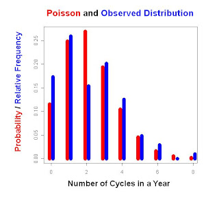
Journal of Statistics Education. They model three baseball events as a Poisson Process: no-hit games, triple plays, and hitting for the cycle. Using data from 1901 through 2004 they get the distribution shown above of how many cycles are seen in a given season. The observed results are a bit short on seasons with exactly 2 players hitting for the cycle, and there are a few more seasons than expected with exactly 1 player hitting for the cycle. The expected results are shown in red: a Poisson distribution with the observed mean of 2.19.

Over the time period examined, nearly 160,000 games were played, and only 0.14% of these games had a player hit for the cycle. As Huber and Glen found the cycle is rarer than a triple play but not as rare as a no-hitter.

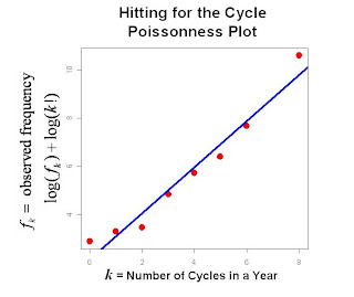
So how closely does this match a Poisson process? One measure is a Poissonness Plot developed by Hoaglin (American Statistician 1980). If f[k] represents the observed frequency of a random count k then the log of the Poisson density would essentially be -λ+klog(λ)-log(k!). So that in a plot of log(f[k])+log(k!) against k, a straight line would indicate a good fit to a Poisson distribution. The slope of this line is an estimate of log(λ). Here log(λ) is 0.9583, so that an estimate of λ is 2.607. Of course the maximum likelihood estimate is simply the mean number of cycles per season 2.19. Since the variance of a Poisson distribution is also equal to λ, this would provide another estimate of 2.90. Note the Poissonness plot estimate falls in between the two.

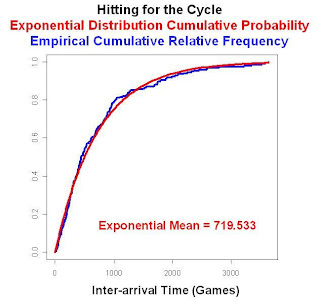
Another way of checking for a Poisson process is to check the inter-arrival times, that is, the number of games between any two players hitting for the cycle. These inter-arrival times should follow an exponential distribution. The figure below shows the cumulative relative frequency of the observed time between cycles for the period 1901 through 2004. Also shown is the theoretical exponential cumulative probability distribution with a mean equal to the observed mean of 719.533 games. This indicates that the cycle process is memoryless. Even if there have been 1000 games without any major league player hitting for a cycle, you would still have to wait on average over 719 games more before one does.

For Aubrey Huff it was certainly a special night. Not only did he hit for the cycle he also had the 1000th major league hit and the 200th double of his career. Even with all that the Orioles still lost the game to the LA Angels 9 to 7.