Monday, July 27, 2009


Wine consumption for various countries proportional to the area of each circle. Strangemaps.wordpress.com has an interesting discussion of trying to make sense of the numbers in this map that has no legend to tell you what the numbers mean. Why is Luxembourg so big?

A Sad Tally Indeed

Discrete distribution of Golden Gate Bridge Suicides. Locations plotted to the nearest light pole. The bay side is more popular than the ocean side. Any conjectures as to why? From strangemaps.wordpress.com via sfgate.com

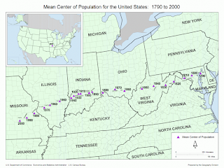
A Mean Streak Across the Country


The mean center of population for the US. From the US Census Bureau: “the point at which an imaginary, flat, weightless and rigid map of the US would balance perfectly if weights of identical value were placed on it so that each weight represented the location of one person on the date of the census.” From strangemaps.wordpress.com

Delay

Sorry for the long break. Life interfered.