Friday, March 25, 2011

Friday Fun: Comparing Apples & Oranges


A totally fair, balanced, unbiased comparison. Really. No really! See more of this chart at: smarter.org via junkcharts.

Saturday, March 19, 2011

March Madness: It Didn't Happen Again!


Since 1985, when the NCAA Division I Men's Basketball Tournament expanded to 64 teams, a team seeded (or ranked) 16 (last in each of the four regions) has never beaten a team seeded first. Over the 27 years from 1985 to 2011, (108 pairings) the number 1 seed has won by as much as 58 points (in 1998, Kansas(1) over Prairie View(16) 110-52). But twice over that time, both times in 1989, the number 1 seed narrowly edged out the number 16 seed by only 1 point (Georgetown(1) over Princeton(16) 50-49 and Oklahoma(1) over East Tennessee State(16) 72-71.

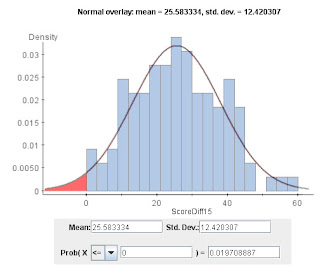
The histogram above shows the winning point margins. It closely fits a normal distribution with a mean of about 25 and a standard deviation of about 12. This gives us an estimate of the probability that a 16 seed could beat a number 1 seed, as just the probability that this normal distribution is less than zero. Here, we get a value of about 2%.

Wait 'til next year!

P.S. (3/20/2011)
A colleague observed that since a 16 seed has never won over a 1 seed in 108 trials of men's basketball (although it has happened in women's in 1998, 16 seed Harvard over 1 seed Stanford 71-67) that a 2% probability of an upset is perhaps too high and the probability should be less than 1% (1/108). But this treats a trial as only a success or failure and ignores how close the score was to an upset. A value near 1% is likely too small.

Sunday, March 13, 2011

Multiple Regression Model c. 1911


A multiple regression model from George Undy Yule's "An Introduction to the Theory of Statistics" (1911) page 242. The residuals can be seen in the edge-on view.

Wednesday, March 9, 2011

Contours of Use


Here are scatterplot contours of hand placement in opening a door at a health center stairwell. The door itself is the darkest color shown, but it has been painted over with white, blue, and peach(?) colored paint. As thousands of hands push the door open they slowly rub away some of the paint, leaving bivariate contours of greatest use. Horizontal and vertical frequency of hand placement can be readily seen in the paint wear pattern.

Tuesday, March 1, 2011

3D Punching Bag Scatterplot


A 3D scatterplot made of 1300 punching bags (click picture for larger view) by artist Michael Kalish from Wired, with an impressive 2D marginal scatterplot of Muhammad Ali.

Matching Normal Densities


An image of the wear on exit doors at a Barnes and Noble bookstore in Rockville, Maryland. Most wear is located a little below shoulder height as customers push on the door with outstretched arms as they exit. Or are they holding open the door with fingers as they enter? It turns out it's both. (Yes, I stood there and watched!). It's both uncomfortable and inefficient to open the door much higher or much lower. We're left with a greater frequency of use centrally located with less and less wear above and below: a unimodal frequency distribution of wear. Considering that human height is approximately normally distributed, the patterns here should reflect that normality. It's interesting to note that the left hand door seems to have a frequency distribution of wear that sits slightly above that for the right hand door.
Any ideas as to why?