Last week’s image was of cherry blossom petals that had
fallen on a stone walk, a random realization of a spatial
Poisson process. In
such a process, the probability of some number of petals falling on any stone
is proportional to the area of the stone. The mean number of petals falling on
the larger stones is 8.71. The mean number of petals falling on the smaller
stones is 5.58. Their ratio is 1.56. The ratio of the stones’ area is 1.5. Such
a close agreement is what a Poisson process should produce.
Not so fast, implies
commenter Kevin. He suggests that we
should test whether our observed ratio of 1.56 is significantly different from
the ratio of the stones’ area of 1.5. My intuition tells me that, with the
large variability in a Poisson process and such a small sample of fallen
petals, we would need a much larger difference between the observed and
expected ratios for the difference to be significant. But let’s test it.
First, consider the larger stones. If we count those laid
down horizontally, left to right, from top to bottom, my counts (again likely prone
to error) are 12,9,10,9,11,13,3,13,11,7. For the larger stones laid down
vertically, left to right, from top to bottom, I count 12,6,7,6,11,6,6,10,10,4,7 petals.
For the smaller, square stones, left to right, from top to bottom, I count
3,3,2,6,8,4,8,11,4,5,7,6 petals.
Let’s
investigate whether these data can be modeled with a
Poisson distribution. For
example, the mean and variance for the larger stones are 8.71 and 8.61,
respectively, values close to the equal mean and variance expected for a
Poisson distribution. But we can do more.
The image above is called a
Poissonness plot (Hoaglin 1980).
This one is for the sample of petals from the larger stones. It allows us to
graphically test whether a Poisson distribution is an appropriate model for the
petal counts. Let x[k] be the count of stones collecting k petals, we plot on the
vertical axis: log(x[k])+log(k!) against k (on the horizontal axis). In such a
plot, Poisson counts fall upon a straight line with a slope equal to the
logarithm of the Poisson mean. This is what we see for the larger stones. The
plot for the smaller stones is also straight.
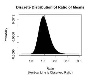
Kevin suggests testing our observed ratio to see if it is
significantly different from the expected ratio of 1.5. Since we are dealing
with discrete distributions we can compute the exact probability distribution
for this ratio. The larger stones have a length of 9.375. The shorter, square
stones have a length of 6.25, for a ratio of 1.5. We take these as the null
parameters of two independent Poisson distributions. Our samples of sizes 21 and 12 have
sums that are also Poisson. The joint distribution is simply their product,
allowing easy computation of the probabilities for the ratio of the means. Its
discrete probability distribution is shown below (ignoring the small probability that the denominator is zero, 2.6 x 10⁻³³
).
Although this appears to be a
darkly colored continuous probability density, it is actually a discrete distribution of probability mass plotted as densely packed individual vertical lines or spikes of probability.
For this null distribution our observed ratio of means, 1.56, has an upper tail
p-value of 0.39. This, of course,
is not significantly different from 1.5. In fact, our observed ratio would have
to exceed 1.89 to be significant at the 5% level. Thanks for the prompting,
Kevin.