Monday, April 28, 2014

Conditioned Steps

Conditional frequency distributions of footfall wear on several wooden steps at the Simon Pearce glassworks Mill at Quechee, Vermont. The lowest of these four steps is on the left, showing a distribution of wear ranging across much of the step. The variability of footfall placement along the edge of this narrow step is great. The next step to the right in this image shows a greater concentration of wear near the middle of a slightly wider step, allowing for a more full foot placement. The next step is wider still with a concentration of wear shifting slightly to the right (downward in this image). Finally, arriving on the top step of the landing (rightmost in this image) the footfalls cause a  nearly circular pattern of wear as feet need to turn to the right (where you can see my feet standing to take the picture). This path continues ascending on the next set of stairs to an upper floor.

Left to right we see conditional frequency distributions of wear: conditioned on each step. Imagining a line connecting the means of these distributions would show a line of decreasing slope. This line is that of the conditional mean of footfall placement conditioned on each step. The changing variability of wear on each step, shows the pattern of the conditional variance: greater variance on the lower (leftmost) step and lesser variance on the higher (rightmost) step, a concept termed heteroscedasticity.

Monday, April 21, 2014

Misleading Inverted Time Series

Here is a graphic published by Reuters that has been making the rounds on the web, here and here. It depicts the number of gun deaths in Florida. On first glance it appears that gun deaths had dropped just after 2005 when Florida enacted its 'Stand Your Ground' law. The trouble is, the vertical scale is inverted: higher numbers are lower on the graph not higher. The post on the Business Insider showed the graph presented in a more standard way: higher numbers are plotted higher on the graph.
Its much clearer in this graph that gun deaths in Florida increased after 2005 and the enactment of the 'Stand Your Ground' law. So why produce a graphic that is so counter to common expectations and understanding? Politics? Point of View? Artistic Vision? or as the artist says, "Personal Preference"!

The designer is Christine Chan. She says her inspiration was based on this graph from the South China Morning Post titled "Iraq's Bloody Tool" plotting deaths as dripping blood. Artistic choice or not, this approach is misleading.


Monday, April 14, 2014

Death of a Favorite, Surprising Example

It happened this past week. The death of one of my favorite examples
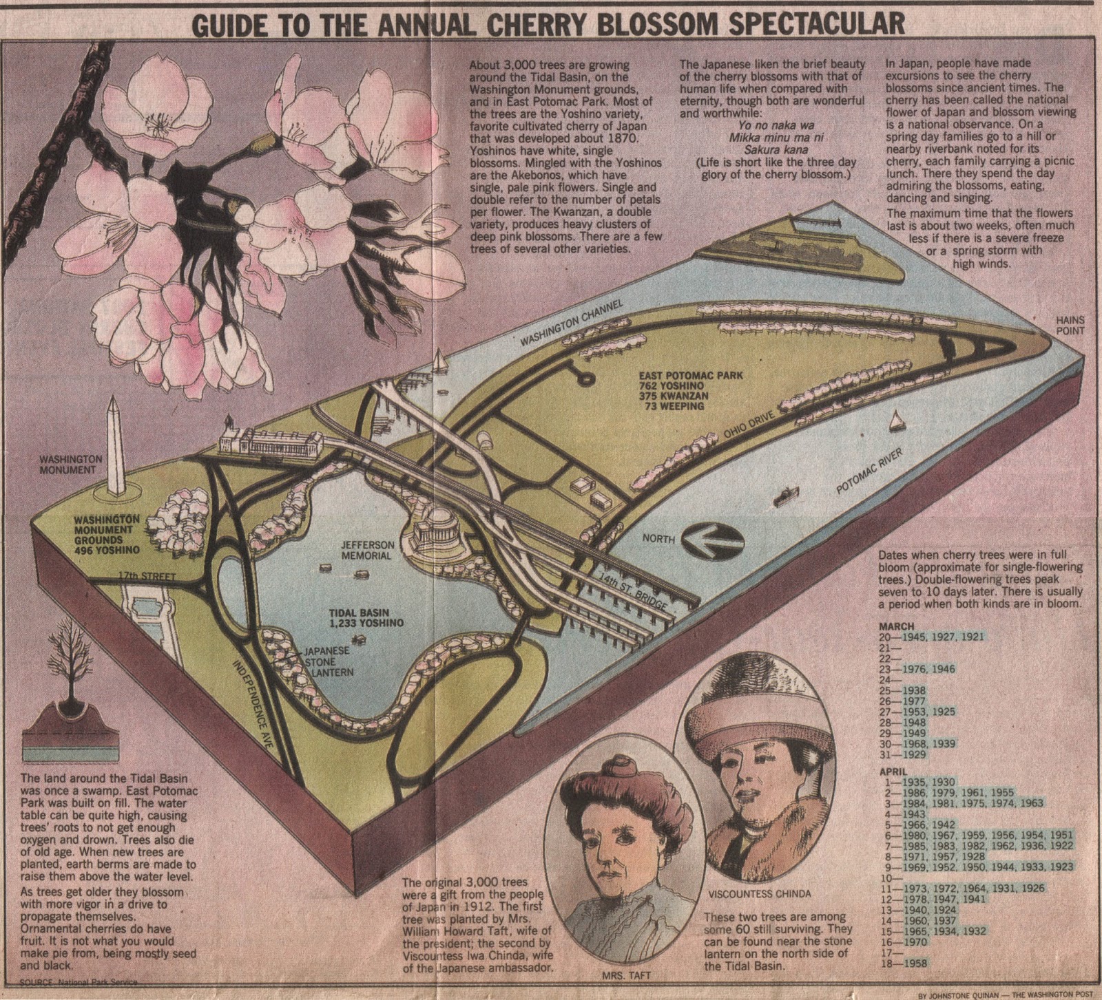
. This one about an iconic Washington, DC event: The National Cherry Blossom Festival. Since 1912, Washington, DC has celebrated the arrival of spring with this festival. But the arrival of the blossoms doesn't always correspond with the the date of the festival. Regular records of the monthly date when the Washington, DC cherry blossoms are at peak bloom have been collected by the National Park Service (NPS) since 1921. 
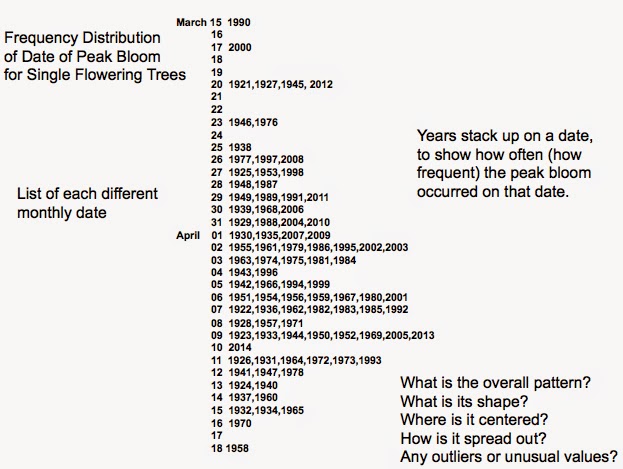
I've posted other uses of the cherry blossoms here and here. The graphic above is from the Washington Post on March 27, 1987. It shows the frequency distribution of those monthly dates as a stem and leaf diagram. The stems are the monthly dates. The leaves are the years when that date was noted by the NPS as the peak bloom. This is the date when 70% of the trees are in full bloom. Like many frequency distributions it is sparse for the early blooming in mid-March, becoming more frequent towards the end of March and into the first few weeks of April, and then finally becoming sparse again towards mid-April. None of this is unusual or surprising. Unusual outliers in the peak blooming dates might be found in the early or late times, (as I have often taught my students). But something more surprising hides in plain sight near the most frequently occurring peak dates. Since those regular records began in 1921, a peak bloom was never noted on April 10. The surrounding dates of April 9 and April 11 have been noted as peak blooms several times, but not April 10. For this 1987 graphic, that was 65 years of missing April 10. This surprising gap in a high frequency region of the distribution is surprising. In my class in Basic Statistics we talk about possible causes: Is April 10 a commemorative date for the Park Service? Are they otherwise occupied on April 10? Do they take April 10 off? or Is this just a result of randomness?

I have kept track this for the past 27 years, and through 2013, this pattern has stayed. Until, 2014! This past week the peak bloom has recorded by the National Park Service to be on April 10. The first such time in 94 years. My longtime example has died. Randomness has filled in the gap.

Here is a view of my classroom presentation slide with the new offending date filled in.


Monday, April 7, 2014

Scrabble Distribution

Here is a display of the frequency distribution of the letters used in Scrabble arranged alphabetically.
And here is the frequency distribution of letters arranged by their point value. Although the left-most stack is labeled with the letter "A", it is a stack of all the letters with a one-point value: A,E,I,L,N,O,R,S,T,U  and similarly for the other stacks. Not shown are the two blank tiles.