Monday, May 26, 2014

Poor Comparisons: circles or spheres

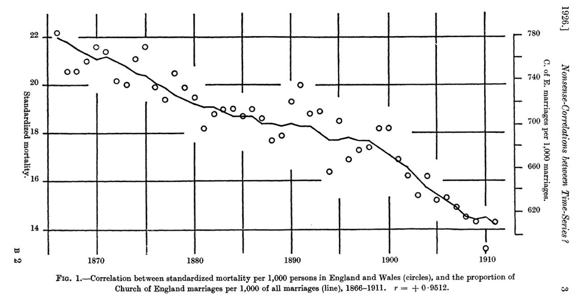
Here is a post from the Wall Street Journal's Numbers Guy from earlier this month. It purports to show the number of Major League Baseball pitchers that have undergone Tommy John surgery to repair their torn elbow ligaments. I don't dispute the numbers, but the visual is wrong. We are, I suppose, to imagine baseballs whose size represents the numbers displayed. The ratio of the number of surgeries from 2005-14 to those of the previous decade 1995-2004 is 181/87 = 2.08. The graphics should agree. They don't. The ratio of the diameters of the circles for these decades is 1.8. If we interpret them only as circles, then their areas would have a ratio of 1.82 = 3.24, that is, more than three of the red-colored 1995-2004 circles can fit inside of the blue-colored 2005-2014 circle, not ratio of 2.08 given by the numbers.

But it gets worse. The graphic designer has displayed baseballs, keeping with the theme. Viewed as balls we are now would be visually comparing volume not area. The ratio of the volume of the baseballs for these two decades would be 1.83 = 5.832.

One would have thought that such well known and documented graphical mistakes would be in a catalog of standard bad examples to avoid. Such examples are famous, this one from the Washington Post in 1978.
Here the graphic artist scaled both the height and the length of each dollar bill by the ratio of the purchasing power for each year relative to 1958, resulting in an area of the dollar that visually represented the square of the ratio, shrinking the visual impression even more. Compared to a dollar in 1958, the Carter dollar, was labeled as 44 cents, indicating that the dollar's purchasing was less than half of what is was is 1958. But since both the dimensionas of the bill was scaled by 0.44, the area of the Carter dollar is now 0.1936, that is more than 5 Carter-sized dollars would fit in the Eisenhower dollar. This leaves the visual impression that the purchasing power of the Carter dollar was less than 20 cents.

Still more examples are in the chapter on The One-Dimensional Picture in the old standard How to Lie with Statistics by Darrell Huff.


Monday, May 19, 2014

Nonsense! Correlations!

In 1926, G. Udny Yule published a paper in the Journal of the Royal Statistical Society, titled, "Why do we Sometimes get Nonsense-Correlations between Time-Series?--A Study in Sampling and the Nature of Time-Series" He begins by describing the problem:
The graph above illustrates this problem for the time series of  mortality (death rate) and marriages (marriage rate) in England from 1866 to 1911. Since these two time series are both decreasing over these years, they start out high together and end up low together, so their correlation coefficient is high (0.95). Their scatterplot is shown below, and if these data were from independent observations, such a high correlation could be quite informative. But since these series are correlated in time, this correlation likely only reflects their time trends and not any other connection. Such a correlation is called spurious.
More recently, a friend (thanks JCT) pointed me to work of Tyler Vigen, explained very well in his video. He has written a program to find such nonsense correlations with hilarious results, such as the high correlation between the per capita consumption of cheese in the US and the number of people who died by becoming entangled in their bedsheets.
This is great fun, and his work has been widely circulated on the internet lately, here, here, and here as examples. Many of these discussions emphasize that "correlation does not imply causation" and some even invoke this xkcd cartoon

But spurious correlations can be more insidious than these graphs illustrate. These time series only illustrate how correlating time related variables can be misleading, but spurious correlation can arise with data not correlated in time. For example, drunk driving and fatal accidents increased more in localities that had banned smoking in bars and restaurants than those that had not (from this paper). One might be tempted to conclude that banning smoking causes these bad outcomes. But something more is at work here. Smokers needed to travel farther to find alternative localities that had not banned their addiction. They were on the road more and therefore had more accidents. In economics, these often referred to as an unintended consequences. Many other settings have similar lurking or confounding variables or behaviors, that have nothing to do with time series, that can also give rise to spurious correlations.

But if we have a correlation for two time series, how might we determine whether it is spurious or not? One approach for the Yule's marriage and mortality data is the following: If there is a real, causal connection between mortality and marriages, then when mortality changes (year-to-year), we should see a related change in marriages (year-to-year). If these changes are not related, then the correlation between mortality and marriages (0.95) is likely spurious and misleading. Below is a scatterplot of the year-to-year differences of mortality and marriages. Their correlation is 0.064, suggesting that the previous, time-dependent, correlation of 0.95 is spurious and misleading.


Monday, May 12, 2014

Type I and Type II Errors

Type I and Type II errors simplified. A Type I error is rejecting a null hypothesis when it's true. A Type II error is not rejecting a null hypothesis when it's false. From flowingdata via.

Monday, May 5, 2014

Bell-Curve Table Wear

The restaurant table above has a polished tile center that is bordered with mitered wood trim. These wooden borders seem to have been installed a little proud of the tile center. Plates and silverware set in front of a seated diner have repeatedly sanded down the proud edge of the trim to more smoothly match the level of the tile center. This can be seen as the vertical, lighter region of the trim where it meets the tile center. Plates, silverware, cups, glasses, etc. are most often placed along the center of the edge, causing much more repeated sanding of the center of the trim. This can be seen in the broader, lighter colored wooden edge next to the tile. Less often, table settings are placed to the left or right of the diner (bottom and top in this picture). This is results in less wear on the trim and the progressively narrowing of the lighter sanded area next to the tile center. What results is a broad, bell-shaped patten of the frequency of wear: more wear in the center, less on the edges.