“Ordering my cab to
wait, I passed down the steps, worn hollow in the center by the ceaseless tread
of drunken feet,” Dr. Watson in The Adventure of the Man with the Twisted Lip by Arthur Conan Doyle. (Bell-shaped carpet wear from the ceaseless feet at a restaurant in Snow Hill, Maryland.)
Monday, November 24, 2014
Monday, November 17, 2014
Data Literacy: It's Elementary
The Washington Post has an article this morning (17 November, 2014): "In elementary schools, lessons on data literacy," by IT reporter Mohana Ravindranath. She describes a "growing movement of educators creating lesson plans to teach students to collect and analyze data." One goal is "to derive opinions from measurable, real-world data." Another, is to address the shortage of "managers and analysts who can make decisions based on big data analysis," according to management researcher Michael Chui. The Washington Post article goes on to quote Chui:
Says one science coordinator at an elementary school, evaluating the effectiveness of these lessons is "ultimately if the kid’s able to have a conversation about it and ask questions about it.”
A great goal for students of all ages. That this is taught and expected of even elementary school students is inspiring.
(On a very minor display note: the introductory graphic to this story is an image of a computer monitor showing results from a school's Science Festival using software from Tuva Labs. Dot plots are displayed showing the arm spans by gender. I wonder about the zoom-in that is shown for one data point. It seems only to extract the same dot plot that's on the screen. That's something to ask a question about!)
“It makes sense for us to be thinking about education, starting in early childhood, about concepts such as the difference between correlation and causation, what it means to have a bias as you think about data, conditional probability. These are things we as humans don’t naturally do . . . these are learned [concepts],” Chui said in an interview. He added that curricula should teach students about the realistic limitations of data sets — extraneous information, or sampling error, for instance.The article describes students collecting their own data. Third-grade students collect daily temperature data, fifth-grade students record the hours of daylight and relate them to the earth's motions, and even kindergarten children "recording predictions for whether it will be sunny outside the next day, or which foods will decompose fastest, along with the results."
Says one science coordinator at an elementary school, evaluating the effectiveness of these lessons is "ultimately if the kid’s able to have a conversation about it and ask questions about it.”
A great goal for students of all ages. That this is taught and expected of even elementary school students is inspiring.
(On a very minor display note: the introductory graphic to this story is an image of a computer monitor showing results from a school's Science Festival using software from Tuva Labs. Dot plots are displayed showing the arm spans by gender. I wonder about the zoom-in that is shown for one data point. It seems only to extract the same dot plot that's on the screen. That's something to ask a question about!)
Labels:
causation,
correlation,
dot plot,
sampling distribution
Monday, November 10, 2014
Pie Rules
"There is no data that can be displayed in a pie chart, that cannot be displayed BETTER in some other type of chart," is a quote Wikipedia attributes to the late, great statistician John Tukey, (I've found no original source for the quote). It gets worse when Excel and/or graphic designers start adding chart junk of 3-D projections in hope of adding more visual interest.
Any reasonable comparisons in the above chart are impossible.
If you insist on using pie charts, Benjamin Starr at Visual News offers some history and sensible guidelines for using pie charts.
First, as the lead-in graphic above illustrates, display no more than five categories in a pie chart. Many small areas are difficult to compare.
Second, since wedges of a pie are difficult to compare side-by-side, Starr says don't use multiple pie charts for comparison. Use stacked bar charts instead, as shown above.
Third, make sure that the percentages add up to 100% and that all slices are drawn proportionately to the percentages they purport to represent.
And finally, order the slices from largest to smallest, starting at 12 o'clock and continuing either clockwise or counter-clockwise to aid in comprehension.
Of course, we've posted some pie charts here and had some fun with them.
Labels:
compositional data,
data representation,
pie chart
Monday, November 3, 2014
The Curse
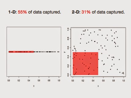
The Curse of Dimensionality addresses the difficulty of dealing with multivariate data. It warns us that, for a set of data in high dimensions, local neighborhoods are almost certainly empty of data points and neighborhoods that are not empty are almost certainly not local.
This is a nice way to help visualize the Curse.
Labels:
bias,
multivariate,
variance,
visualization
Subscribe to:
Posts (Atom)


