

Devoted to images that illustrate statistical ideas
Thursday, February 23, 2017
Couldn't Resist
Friday, February 3, 2017
Post Modern Bell Wear
Watch a fun video The Evolution of Tap Dance by Post Modern Jukebox with tap dancer Sarah Reich. Note the bell-shaped distribution pattern of wear on her tap platform: most wear in the middle and less towards the edges.
Monday, December 19, 2016
Self-Referential Santa

Futility Closet offers Raymond Smullyan's self-referential proof of the existence of Santa Claus:
A: Santa Claus exists, if I am not mistaken.
B: Well, of course Santa Claus exists if you are not mistaken!
A: So, I was right.
B: Yes.
A: So, I was not mistaken.
B: Yes.
A: Hence, Santa Claus exists.
Monday, October 31, 2016
Stepping Up

But a rung near the bottom has a bi-modal pattern, showing the wear resulting from both left and right feet. This doesn't persist on higher rungs. There the wear seems more central. So why not on the lower rung as well? Perhaps central steps on higher rungs feel safer. A care that is not that needed closer to the ground.
Monday, October 24, 2016
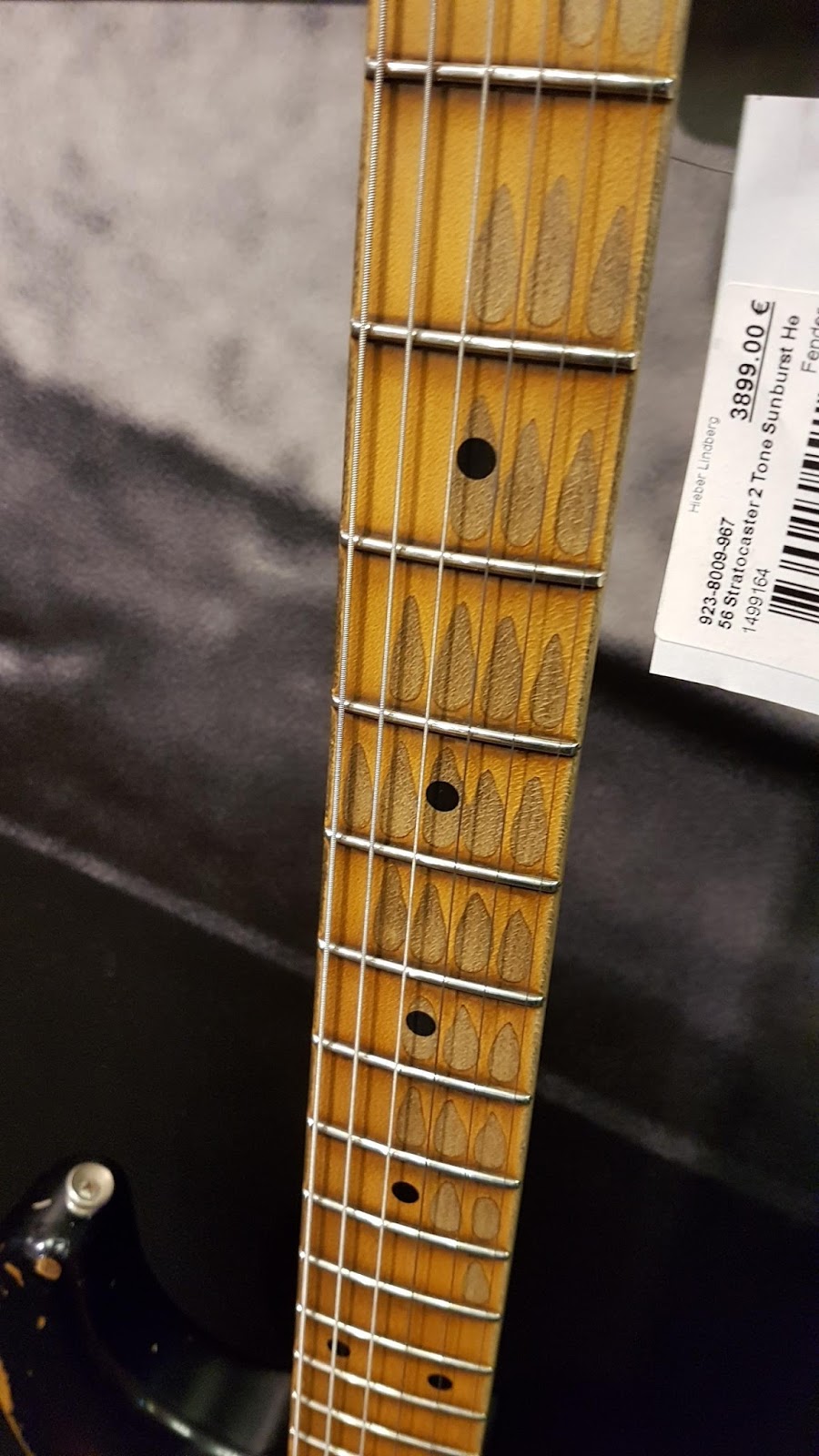
Guitar Fret Wear?
Monday, October 17, 2016
Fair, Minimal Symmetry Dice
Tuesday, October 11, 2016
Menu Basket Queue

This is a view of a basket of menus at a restaurant in
Chincoteague, Virginia. Notice the pattern of marks left as groups of menus scratch
the wall when they are returned to the basket. As customers are seated at the restaurant, they are given
menus that are removed from the right hand side of the basket. After ordering, the menus are returned to the basket and placed to the right of the remaining menus. When a single is menu returned, it nicks the wall at a location that depends on how
many menus are currently in the hands of customers. If few menus are out with
the customers, more remain in the basket and the wall marks of this returning
menu will be further to the right. If many menus are out with customers, say just before the lunch rush, this returning menu will make a
mark on the wall further to the left.
But it is not often that a single menu is returned alone. It is much more likely that a group of menus will be returned to the
basket in a bunch. The size of the bunch that is returned is random depending
on the size of the party seated. Each of the menus in the bunch makes a mark on
the wall as they are returned to the basket. What we see is a steady state
distribution of the number of seated customers, with menus in hand, waiting for
their order to be taken.
Subscribe to:
Posts (Atom)