Great interactive histograms of the age distributions in selected countries since 1950 and projected out to 2050. From GE via information aesthetics
Tuesday, July 27, 2010
Interactive Age Distributions
Great interactive histograms of the age distributions in selected countries since 1950 and projected out to 2050. From GE via information aesthetics
Wednesday, July 14, 2010
Plotting a Newer Court
Tuesday, July 13, 2010
CEO's can sure drink a lot

A data comparison of average US salaries, represented by a Styrofoam cup, and average US CEO's salaries, represented by many champagne glasses for 1965 and then 40 years later in 2005. The ratios are 1:25 in 1965 and 1:275 in 2005. Part of many more interesting data comparisons, with videos, in the exhibit "Common Sense - An Art Exhibit About the American Dream" at the College of Creative Studies, Taubman Center in Detroit.
Monday, July 12, 2010
So Close Yet So Far

I went to the Corcoran galley of Art this past weekend to see the exhibit of artist Chuck Close. An amazing array of mosaic or block portraits made with paint, paper pulp, thumb prints,...Stand far away and the portrait is obvious, but the closer you look (no pun intended) the portraits turn into a jumble of abstract marks, symbols, colors, and textures. After the visit I did a little research and found this article from Science about this effect. In a 1999 article by psychologist Denis Pelli, "Close Encounters - An Artist Shows How Size Affects Shape," shows the following graph and its caption from an experiment. They had viewers stand close to a Close portrait and more away, noting when a facial feature (the nose) eventually emerged.
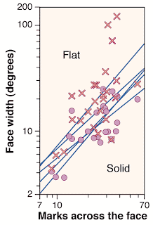
The nose test. The critical face width of Close's portraits plotted against the number of marks across the face. The regression lines, one for each of five observers (accounting for half of the variance), are plots of the results for judging nose emergence on each of the 33 gridded portraits from the Chuck Close retrospective (except the Keith/Six Drawings Series) (2). X and O are raw data for two observers. Size independence predicts a vertical line. All five lines have log-log slopes close to 1 (mean 1.0, SD ± 0.2), showing that the perceived shape does depend on size.
I would think a better plot would have face width as the explanatory variable and marks across the face to be the response. Independence would then be testing for a slope of zero (a more standard way for statisticians to represent it). Here is the original graph flipped to see the scatter.
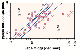
Of course the lines drawn here are not the regression lines of the marks regressed on the face width. In fact, it appears that a new regression of marks on face width would have slopes much closer to zero! Is it significantly different from zero? I'd have to digitize the data off the graph to check for sure, but was the original graph chosen to emphasize the conclusion that size and shape are dependent?
Wednesday, June 30, 2010
How Mariano Rivera Dominates Hitters
Here is an excellent animation from the New York Times showing how Mariano Rivera has been such a dominant closer in baseball. It shows how his similar deliveries result in drastically different ball placement at the plate. They analyzed nearly 1300 of his pitches over the 2009 season. The scatterplots show the location of the ball as it goes over the plate. He is amazingly adept at keeping the ball on the corners and away from the middle of the plate, where a hitter would have the best contact.
Tuesday, June 29, 2010
The First Published Random Walk?
According to Alex Bellos in his new book "Here's Looking at Euclid", this is the world's first graph of a random walk, published by John Venn in his book "The Logic of Chance" in 1888. Venn produces this path using the digits from 0 to 7 from the first 707 digits of π. Venn writes,
"Of these, after omitting 8 and 9, there remain 568; the diagram represents the course traced out by following the direction of these as the clue to our path. Many of the steps have of course been taken in opposite directions twice or oftener. The result seems to me to furnish a very fair graphical indication of randomness. I have compared it with corresponding paths furnished by rows of figures taken from logarithmic tables, and in other ways, and find the results to be much the same."Here are the directions Venn uses and the results from the first ten decimal digits.
Monday, June 28, 2010
YADDA - Dulles Doorts

Yet Another Door Distribution Again. This is an pair of automatic entry doors to the terminal at Dulles airport outside of Washington, DC. Although the doors open automatically as you approach, passengers pushing luggage carts ahead of them hit the bottom edge of the doors when they open too slowly. This leaves a distinctive wear pattern on each door. Most carts hit the same spot, some cause wear a little higher, some cause wear a little lower. This could be from different cart heights or different loads on the carts or from the slight dents in the door from the repeated bumpings, causing the carts to hit more off the center target. A bell-shaped frequency distribution is left behind. Most wear in the center less towards the extremes.
Friday, June 4, 2010

Not so much an image this time, but a quote I like from the book "The Great Influenza" by John M. Barry that I am currently reading.
"To be a scientist requires not only intelligence and curiosity, but passion, patience, creativity, self-sufficiency, and courage. It is not the courage to venture into the unknown. It is the courage to accept -- indeed, embrace -- uncertainty."
Monday, May 31, 2010
Bell-Shaped Animals

Adapted from a graphic in Life magazine October 10, 1955 showing speeds of various animals. The artist has displayed the animals sampled on a horizontal scale of speed. There are few slow animals on the left, many more medium speed animals in the middle, and few fast animals on the right. The outline of the cloud of animals shows the essence of a roughly bell-shaped frequency distribution with a little skewness to the right. But take out the elephant and much of the skewness goes away also.
Thursday, May 27, 2010
Artificial Population Sampler
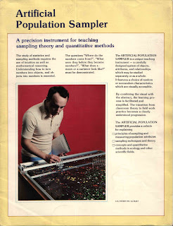
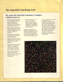


I found this brochure in an old file. It dates from 1978. It shows a physical model for teaching sampling and quantitative methods in ecology. Click on the images for larger views. Developed by Arnold M. Schultz, a Professor of Systems Ecology at the University of California, Berkeley and used as a teaching tool beginning in 1958. His 1961 patent application seen here was awarded in 1965.
The model contains two plates of plastic containing arrangements of vinyl discs of various sizes and colors that represent populations in a square region of the Cartesian plane. One plate is called the random population plate made up of six colors that seem to be distributed uniformly over the square. The other plate is called the nonrandom population plate made up of 19 colors that are arranged in rough clusters to illustrate more contiguous, local populations. Instruments are provided for measuring locations and size. Along with color they provide both qualitative and quantitative data for estimating means, variances, density, diversity from various random sampling methods. The population parameters are fixed in each of the plates allowing assessment of measurement error and bias. A paper by Schultz et al. from the Journal of Range Management (1961,v14,n5,pp 236-242) illustrates its use. I've found one listing of the color distribution (from the paper "A comparison of techniques for assessing dispersion patterns," D.W. Goodall and N.E. West, Vegetatio, (40)1:15-27, 1979) but other than a reference to it having six sizes, nothing explicit about the size distribution.
A real hands-on approach to sampling that is very useful for both teaching and research. An example in teaching is illustrated here. Its use in ecological research in 2006 is shown here.
Wednesday, May 26, 2010
Compositional Eating
Are you eating right? This site has dinner plates that graphically help you to keep to certain eating proportions. Of course, you must be careful not to pile-on and overload one section and skimp on others. The area devoted to your food choices might be a good reminder, but it's more the mass of each component that's important to your nutrition.
Thursday, May 20, 2010
Footsie?
Monday, May 17, 2010
Old School Rules: A Normal Slide Rule

Here's a normal slide rule. Yes, it's very old technology, but it helps to see some workings that other high-tech black boxes hide.
Of course you can even get much more extensive stat calculators for your IPhone See StatsMate. Still this is fun.
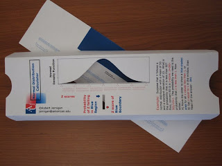
Find the BIG TIF file at this link (or click on the illustration below). And, as requested, here is a smaller pdf version. Print it out on heavy card stock.
Cut off the slider on the left and set it aside. On remaining front section, cut out the normal curve and the results window. Fold back the top and bottom. Then slide in the slider with the numbers down and the blue rectangle up.
Pick your z-score and read the area of the blue shaded region.
Subscribe to:
Posts (Atom)


