From Flowing Data, an interactive dotplot showing the distribution of annual salaries in various fields. Selections can be made for the 1960s (above), the 1980s, 2000s, and 2014. As a time range is selected, the dots representing the annual salaries of 50 randomly selected people, dynamically redistributed themselves to reflect the times salary frequency distribution. Compare the dramatic change in spread from 1960s above to the 2000s below.
Monday, July 25, 2016
Salary Dots
From Flowing Data, an interactive dotplot showing the distribution of annual salaries in various fields. Selections can be made for the 1960s (above), the 1980s, 2000s, and 2014. As a time range is selected, the dots representing the annual salaries of 50 randomly selected people, dynamically redistributed themselves to reflect the times salary frequency distribution. Compare the dramatic change in spread from 1960s above to the 2000s below.
Monday, July 18, 2016
YADDA Boston
Yet Another Door Distribution Again, this time at the Summer Shack Restaurant in Boston. Not many patrons grab the door near the handle, not many reach it much higher. Most grab the door, and wear away its paint, at a comfortable, likely shoulder height. A bell-shaped frequency distribution results. Thanks Laura.
Labels:
bell-shaped,
distribution,
frequency,
YADDA
Monday, July 11, 2016
Monday, July 4, 2016
The Fourth of July
Vijay Pandurangan has considered these colors along with those of many other films. Below are his findings for the year 1989:
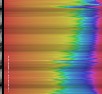
But he has done more. He has looked at the colors in movie posters from 1914 to 2012 and produced an interactive image where you can select any year within this range and see the pie chart of movie posters from that year. Here is a still image of his interactive one.
He also produces an interactive image (still image below) with lightness and saturation ignored.
Movie posters seem to have gotten bluer over time. We've seen movie poster colors here before. Thanks for the link Nick.
Subscribe to:
Posts (Atom)


