Monday, February 23, 2015
Gas Pump Wear
Labels:
bell-shaped,
distribution,
frequency,
normal
Monday, February 16, 2015
Waldo, revisited
We've seen the scatterplot and marginal distributions of Waldo's location in a collection of Where's Waldo. These were from Ben Blatt at Slate.com. Now Ronald Olsen has added a plot of the contours of a kernel density estimate of the joint frequency distribution of Waldo's location on the facing pages of the Waldo books. Darker color indicates higher density. Olsen then dynamically computes the optimal search path. Try it out. Can you find Waldo quicker?
Labels:
density,
distribution,
frequency,
joint,
kernel
Monday, February 9, 2015
Selective Correlation
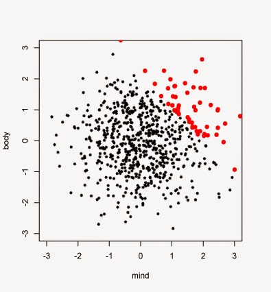
Sociologist Gabriel Rossman of UCLA has an article "When Correlation Is Not Causation, But Something Much More Screwy" in The Atlantic. It graphically shows how calculating correlations on selected samples can produce misleading results. He imagines two characteristics of aspiring actors, ability (mind) and attractiveness (body) plotted in a scatterplot. Random observations from independent standard normal distributions are drawn to represent these variables in a population of actors. Most actors are centered around zero with fewer well above or well below, on mind or body. But since mind and body are chosen independently there is no correlation shown in the plot, that is, no tendency of the plot to tilt with a positive or negative slope.
But then he imagines computing the correlation between mind and body from a sample of working actors. To get work, his actors have been selected by casting directors only if they have a high value for the sum of both mind and body. He has marked these working, observed actors with small triangles in the plot. The remaining aspiring non-working and unobserved actors are marked with small circles. The plotted pattern of triangles for the working, observed actors has a definite negative correlation suggesting, wrongly, that either the more able actors are not much to look at or the most attractive actors are dunces in their acting ability. Although this might fit some stereotypical caricatures, it is entirely due to the selective sampling based on the definition that produced our observed sample. He continues with an SAT example as well.
His scatterplot can be improved. Measurements with equal variability should be plotted in a square plot. The plotting characters for the unobserved and observed actors could be more pronounced. See an example below.
Labels:
causation,
correlation,
normal,
scatterplot
Subscribe to:
Posts (Atom)


