Friday, November 29, 2013

Looking at Literary Lives

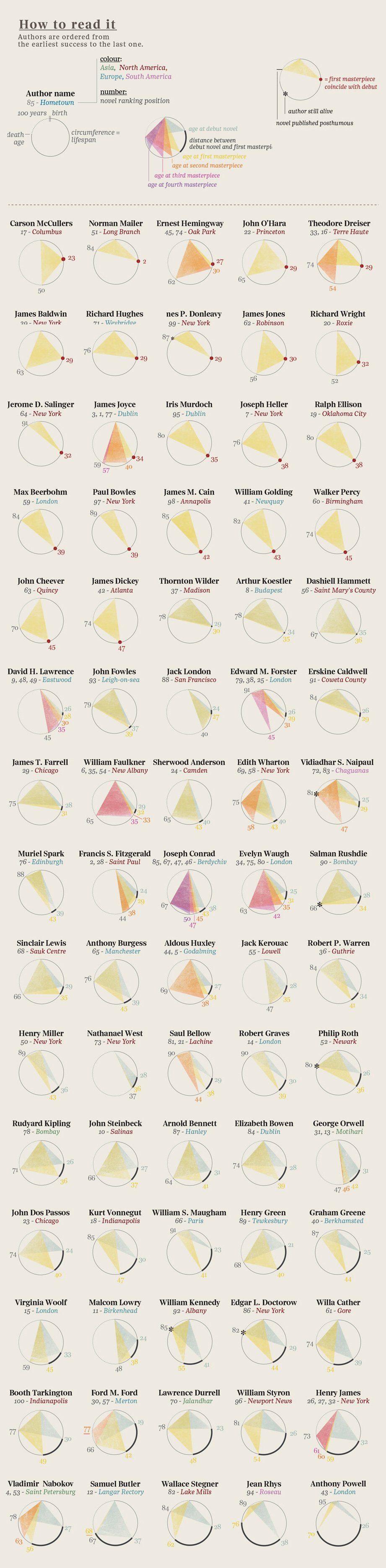
Here is a graphic showing  the event history in the literary careers of famous 20th century authors. It was produced by the design firm Accurat for one of my favorite blogs Brain Pickings. (click here for the image for all the authors). 
 As the legend indicates, begin at an author's birth (at noon on the top of the circle) then move clockwise (around to midnight) representing an elapsed time of 100 years. Triangles are drawn connecting notable events in these literary lives (birth, publication(debut, masterpieces), and death). Authors' ages at their debut mark the vertex of one triangle (with birth and death). Ages, at the publication of  of their masterpieces, are marked by the vertices of other shaded triangles. For many authors, their careers are displayed as a single triangle, showing that their masterpiece was their debut work. Others have several notable works, represented by overlapping shaded triangles. This provides a stylish depiction of these literary lives. But a long-lived author with a lone, early debut masterpiece (e.g. Norman Mailer) might have a triangle of the same size as one whose notable life was cut short (e.g. Jack London). Our eyes/minds are drawn to the sizes of the triangles. What are we to learn from the most central feature of these displays?


Monday, November 25, 2013

Transitions

Thanksgiving is this week, now through Christmas is the most heavily traveled period of the year. It brings to mind how mobile the US population is. Not just for holiday travel, but even for places to call  home. Americans are restless and we move.

Here is a clever interactive graphic illustrating this from data journalist Chris Walker and his site Vizynary (also posted by Wired.) The flows of migration from one US state to another are shown as arcs drawn between two states if at least 10,000 people moved between them in 2012. The width of the arcs indicate the frequency of migration along that path. The data came from the U.S Census American Community Survey. Interactively you can select a state and see the arcs of migration flow to other states. It reminds me of blasts of fireworks. Very well done.

Monday, November 18, 2013

Normal Snare Distribution

Here is the head of a snare drum (thanks Sean) showing the two dimensional, joint distribution of his drumstick hits. The maker, Evans, produces drum heads with two plys of plastic bonded together. In this image the pattern of wear and use reveal themselves through contour lines as closed curves indicating regions of similar frequency of use. The greatest wear is in the lightest colored central region, having seen the greatest frequency of hits. This central region has worn through the first ply showing the remaining plastic support underneath. Sean seems to have a very stable left hand, consistently hitting this small central region in nearly a circular pattern. In this region, the horizontal location of his hits seems independent of the vertical, producing this near circular pattern of the joint distribution. Surrounding this is the darker region of the top ply of plastic. This layer retains more dirt and grime than the underlying supporting plastic. Again the pattern of these hits is nearly circular. It turns out that with simple assumptions, like radial symmetry and independence, the pattern can be shown to be that of a bivariate normal distribution. A result that was thought first published (p. 398) by John Herschel in 1850, but actually discovered much earlier by the American mathematician Robert Adrain in 1808. More details on that in a future post.

But here, perhaps we see slight deviations from normality. The darker ring seems to show slightly  more variability extending vertically and a greater clustering of hits on the bottom of this image. This indicates a bit of skewness towards the top of the picture. Less use and wear is finally shown in the cream colored outer region that has seem very few hits. Thanks again Sean.

Monday, November 11, 2013

Top of the Heap? Mediocre Still

Here is a cartoon from Rhymes with Orange. A student looking at a bell-curve of SAT scores says, "My strategy? Shoot for the top of the bell curve. Then I can look down on everybody." The student clearly has the wrong idea. He seems to think that the peak of the bell curve puts him on the top of the heap. For him, higher on the curve is better than everyone. This mistake we've seen before in this blog here and here. But just perhaps the cartoonist, Hilary Price, has the idea of the bell curve correct. She shades in the letter C on the side. Rather than seeing this as an illustration of the student's multiple choice answer to an SAT question we could imagine that she has assigned to the student a score of C, a traditional average grade, that would be the most common or the most likely grade. This is exactly what the height of the bell-curve represents for such a mid-range grade. The bell curve is tallest for the most commonly occurring grades, not for the highest grade one might strive for. That grade is at the extreme right, where the curve is low. As we've seen before the "Top of the heap is mediocre."

Monday, November 4, 2013

Correlation Ellipse Matrix

Here is an informative graphical representation of the correlation matrix of a data set of weather data on 16 variables. The image is via the RevolutionAnalytics blog and their post on big data available in R. The data mining R package Rattle produced the image. The magnitudes of correlations are shown with a concentration ellipses. Blue ellipses, with positive slopes, display variables with positive correlation with darker blue shading depicting higher positive correlation and lighter blue shading depicting lower positive correlation. Near zero correlations are shown as open, unfilled ellipses that are nearly circular. Variables with negative correlation are shown similarly by red ellipses with negative slopes. Dark red shading depicts greater negative correlation and lighter red shading depicts negative correlations closer to zero. This is a very useful tool to guide the eye through the relationships of the many variables used. Of course, as is well known, correlation is only an appropriate measure of the strength of the linear relationships between two variables when their scatterplot shows approximately the elliptical shape shown in these shaded icons. Examples abound of scatterplots where representing them as above can be misleading. My favorite, below, from the book by Chambers, et al. shows eight scatterplots all with the same positive correlation of 0.7. Correlation and its representation with an ellipsoidal icon is appropriate for only one of these scatterplots. This extols us all to remember, to look at the data.