Monday, June 25, 2007

Shooting a Fence


"Fig. 10.—When deviations in all directions are equally probable, as in the case of shots fired at a target by an expert marksman, the "frequencies" will arrange themselves in the manner shown by the bullets in compartments above. A line drawn along the tops of these columns would be a 'normal probability curve.' Diagram by C. H. Popenoe."

From a 1918 book by Popenoe and Johnson titled "Applied Eugenics". Even though that field has been discredited, they have a clever way of motivating the normal distribution.

"Suppose an expert marksman shoots a thousand times at the center of a certain picket in a picket fence, and that there is no wind or any other source of constant error that would distort his aim. In the long run, the greatest number of his shots would be in the picket aimed at, and of his misses there would be just as many on one side as on the other, just as many above as below the center. Now if all the shots, as they struck the fence, could drop into a box below, which had a compartment for each picket, it would be found at the end of his practice that the compartments were filled up unequally, most bullets being in that representing the middle picket and least in the outside ones. The intermediate compartments would have intermediate numbers of bullets. The whole scheme is shown in Fig. 11. [actually Fig. 10] If a line be drawn to connect the tops of all the columns of bullets, it will make a rough curve or graph, which represents a typical chance distribution. It will be evident to anyone that the distribution was really governed by "chance," i.e., a multiplicity of causes too complex to permit detailed analysis. The imaginary sharp-shooter was an expert, and he was trying to hit the same spot with each shot. The deviation from the center is bound to be the same on all sides."

Monday, June 11, 2007

A Skewed Runway


This is a composite picture obtained from the United States Geological Survey. The top picture is a view of the runway called 1L at Washington-Dulles International Airport. Look at the tire skid pattern from the landing airplanes.

The real runway is many times longer than it is wide. The images shown here have been stretched across the width of the runway and shrunk along the length to better see the pattern of use. Aside from this mild distortion, the tire skid pattern has not been altered.

The aiming point for landing pilots is indicated by two broad white rectangular marking stripes about 1,000 feet from the end of the runway. Touchdown zone markers are groups of one, two, or three rectangular bars every 500 feet arranged on either side of the runway center line.

This runway at Washington-Dulles airport is so long (11,500 feet) that pilots need not land exactly on the aiming point for safe operation. This along with the fact that they definitely don’t want to land short of the runway accounts for the skewed tire skid pattern. Note that although the skid pattern is skewed along the length of the runway it is symmetric across the width of the runway.

The skewness along the length of the runway shows that most of the airplanes land within 1,000 feet of the aiming point, but some land, as indicated by the skid pattern, much further down the runway. The symmetry across the width of the runway is, of course, due to the two sets of wheels of the landing gear and how accurately the pilots hit the centerline of the runway.

The second runway picture shows the entire 1L/19R runway (albeit distorted to fit the page). Notice now the U-shaped distribution of tire skids, as we see the accumulated skid marks from airplanes landing from both directions.

Poisson Parking


The picture shows an aerial photograph, courtesy of the United States Geological Society, of the main visitor’s parking facility of business in Maryland on a Sunday morning in April. Look at the line of 13 parking spaces at the bottom of the picture. Notice the pattern in the oil stains leaked from the cars that park in those spaces. More oil is leaked in the spaces closest to the building.

Parking lots permit both the dynamic and static viewing of statistical processes. A time lapse film of customers entering and leaving a parking lot could allow us to estimate arrival rates, lengths of stay, or number of parked customers as time progresses. But automobiles, not being the cleanest of vehicles, leave their mark. This process is often modeled by a Poisson distribution. The actions of this process can be seen in static pictures as well.

Being Sunday no one is visiting the company, but the many previous visitors have left their marks. Notice the oil stains in the parking places. Much more oil is leaked and deposited in the places used most often. These places are the ones closest to the building. The one parking space closest to the building is a place for drivers with handicaps. Skip this space and examine the pattern starting with this first non-handicapped parking space. This first space will have oil stains when there are one or more cars in the lot. The second space will have oils stains when there are two or more cars in the lot, and so on. Thus, as the distance from the office front door to the car increases, then the amount of leaked oil decreases. This shows the steady state distribution of a multi-server queue. It takes the form of a truncated Poisson distribution, distributing Poisson probability only among the first few positive integers corresponding to the number of parking spaces.

Tri-modal distributions


This is an image of tennis courts at Wimbledon via earth.google.com. Examine the wear pattern in the grass along the baselines.

In most of these courts three distinct areas of wear are obvious. Two are on each corner of the baseline to deliver the ball into the service boxes. The third is a more centrally placed area near the baseline where the players position themselves to anticipate the return volley. Additional wear up and down the baseline is added as the games progress. These are examples of tri-modal distributions, with three prominent areas of most frequent use. Other areas of wear can also be seen inside each of the service boxes, perhaps indicating wear due to doubles play.

Two of these courts seem to have more bi-modal wear patterns indicating mainly the serving positions of the players. Are they not playing a baseline game on these courts? Are these courts used exclusively for service practice?

Thursday, June 7, 2007

Quincunx: a designer's view


A very interesting qunicunx or Galton board illustration by Bob O'Keefe and Springer publishers from a few years back. Most obvious is the segregation of the colors. What could cause this? Perhaps a magnet? May the force be with you!
More subtle is the resulting distribution. It should look more bell-shaped rather than this triangular shape. You could get a triangular distribution from the sum of two uniform random variables, but it would require not pins to jostle the balls, no central hole for them to fall through, and a more symmetric supply of black and white balls. Something like this..


Imagine someone has loaded the balls in the equal-sided diamond-shape shown. The balls are held, waiting to fall above the the v-shaped retainer. Suppose the the entire retainer is removed, all at once. The balls fall straight down, through the slots, into the waiting bins below. The retainer is then replaced and refilled with balls. This is the image we see. This would achieve the resulting triangular distribution.

This, of course, still doesn't explain the segregation of the colors!

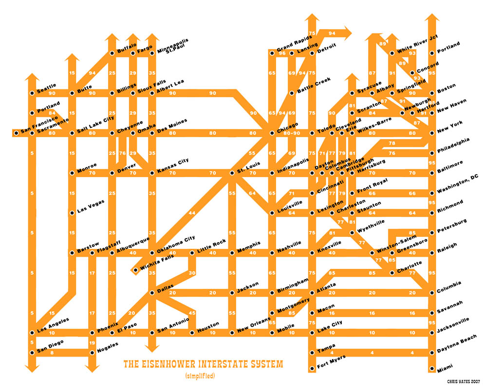
Highway Spacing Proportional to Population Density


A map of the US Interstate System from Chris Yates via www.strangemaps.com
Note how the spacing is directly related to the population density. The distance from Daytona Beach to Tampa, Florida is only 132 miles. Compare that to the distance from San Antonio to Los Angeles: 1202 miles.

Galton's Quincunx


A Qunicunx at the Instituto Butantan, São Paulo, Brazil.

The model was the invention of Sir Francis Galton, one of the English gentry scientists of the 19th century. Galton was a cousin of Charles Darwin, and like Darwin, devoted himself to scientific explorations. He made significant contributions to meteorology, forensic science, and statistics. In the 1870s Galton developed a device to study dispersion of random events. His device consists of an array of pins that allows lead shot, encased behind glass, to cascade through. As a ball of shot falls it strikes a pin and falls randomly to the right or to the left, each equally likely. From there, the shot falls to the next level of pins where it repeats this random walk downward. The shot is collected in separate bins at the bottom of the device. The pattern of shot accumulated in the bins illustrates the variability associated with this simulation of a binomial experiment. He called his device a quincunx, due to the arrangement of pins like the pips on the number five side of a die. An illustration of Galton’s original quincunx can be found at the Galton Institute.


A Watery Histogram


A view of the side of an office building in Washington, DC after a rain shower.


What to look for:


Notice the water on the wall, leaking from the downspout.


Statistical Concept: A histogram showing the pattern of leaking water similar to the way a Galton board, also called Galton's Qunicunx or binomial board, is used to illustrate the binomial probability distribution, also a diffusion pattern demonstrating horizontal spread as the water seeps horizontally and down into the porous brick wall.