Great interactive histograms of the age distributions in selected countries since 1950 and projected out to 2050. From GE via information aesthetics
Tuesday, July 27, 2010
Interactive Age Distributions
Great interactive histograms of the age distributions in selected countries since 1950 and projected out to 2050. From GE via information aesthetics
Wednesday, July 14, 2010
Plotting a Newer Court
Tuesday, July 13, 2010
CEO's can sure drink a lot

A data comparison of average US salaries, represented by a Styrofoam cup, and average US CEO's salaries, represented by many champagne glasses for 1965 and then 40 years later in 2005. The ratios are 1:25 in 1965 and 1:275 in 2005. Part of many more interesting data comparisons, with videos, in the exhibit "Common Sense - An Art Exhibit About the American Dream" at the College of Creative Studies, Taubman Center in Detroit.
Monday, July 12, 2010
So Close Yet So Far

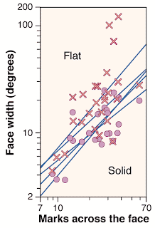
I went to the Corcoran galley of Art this past weekend to see the exhibit of artist Chuck Close. An amazing array of mosaic or block portraits made with paint, paper pulp, thumb prints,...Stand far away and the portrait is obvious, but the closer you look (no pun intended) the portraits turn into a jumble of abstract marks, symbols, colors, and textures. After the visit I did a little research and found this article from Science about this effect. In a 1999 article by psychologist Denis Pelli, "Close Encounters - An Artist Shows How Size Affects Shape," shows the following graph and its caption from an experiment. They had viewers stand close to a Close portrait and more away, noting when a facial feature (the nose) eventually emerged.

The nose test. The critical face width of Close's portraits plotted against the number of marks across the face. The regression lines, one for each of five observers (accounting for half of the variance), are plots of the results for judging nose emergence on each of the 33 gridded portraits from the Chuck Close retrospective (except the Keith/Six Drawings Series) (2). X and O are raw data for two observers. Size independence predicts a vertical line. All five lines have log-log slopes close to 1 (mean 1.0, SD ± 0.2), showing that the perceived shape does depend on size.
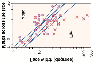
I would think a better plot would have face width as the explanatory variable and marks across the face to be the response. Independence would then be testing for a slope of zero (a more standard way for statisticians to represent it). Here is the original graph flipped to see the scatter.

Of course the lines drawn here are not the regression lines of the marks regressed on the face width. In fact, it appears that a new regression of marks on face width would have slopes much closer to zero! Is it significantly different from zero? I'd have to digitize the data off the graph to check for sure, but was the original graph chosen to emphasize the conclusion that size and shape are dependent?
Subscribe to:
Posts (Atom)
