

Devoted to images that illustrate statistical ideas
Showing posts with label infographic. Show all posts
Showing posts with label infographic. Show all posts
Thursday, February 23, 2017
Couldn't Resist

Monday, September 19, 2016
Wow, It's Hot

When people say "the climate has changed before" these are the kind of changes they're talking about.Since the last ice age glaciation, at no time has the climate changed faster than in the last few generations!
Monday, August 29, 2016
Sunday, Sunday
The measures for "cutters", "nevers", "shavers", and "stackers" are 802, 807, 822, and 826. Here is a frame from late in the video that reports on the right most bar "stackers" as it relates to the other categories."The inaugural study measures overall satisfaction among customers who have used a subscription- or transaction-based streaming video service within the past six months. The study measures customer satisfaction by examining six key measures (listed in order of importance): performance and reliability; content; cost of service; ease of use; communication; and customer service. Scores for each measure are reflected in an index based on a 1,000-point scale.

It's clear that that Sunday Morning is in sore need of knowledgeable graphics editors. Perhaps their artists make their charts telegenic by filling them up with what we would call "chart junk", but in ignoring the proper representation of the data, they are presenting false and misleading images. The numbers are said to be represented here, are again, 802, 807, 822, and 826. The second bar from left almost looks twice as tall as the left-most bar and not a bar that should only be about 0.6% taller. The third bar from the left looks about 3 times taller than the left-most bar and it should only be about 2.5% taller. Finally, the right-most "cord stackers" bar should be under 3% taller, not over 4 times taller! Yes, they give a grid background to judge the sizes, but they are misleading sizes to judge. The 'smiley' satisfaction faces are probably the most reliable description of the data: The satisfaction scores are amazingly the same. From smallest to largest they vary by less than 3%.
Here are the data shown on the graph and then a more accurate rendering (without the chart junk).


Not much difference in satisfaction across all type customers.
Monday, April 25, 2016
Happy Deathday Will?

(Earlier I posted Happy Birthday wishes, misled as others were on the web, but I was wrong. It is Will's Deathday and I corrected my posting, although I thought only Saints were to be remembered on their Death-day. Shakespeare was a genius, but I don't think many would call him a Saint).
Monday, January 25, 2016
The Miracle of Vaccinations

This interactive graphics from the Wall Street Journal multimedia editors Tynan DeBold and Dov Friedman shows the miracle of vaccinations for the US over the last 80 years. Horizontally, are years from 1928 through to 2012. Vertically, are placed the states, plus DC. A vertical line down the center shows when vaccinations for measles were introduced, in 1963. Each year-state block is heat-coded: red indicating many infections down to dark blue (and even lower light blue and white) with few to no infections. Before 1963, the many years of infections produce a very colorful pattern suitable for a nice beach shirt. After 1963, and measles vaccination, we have a basic blue dress shirt. Here boring is the goal. Basic blue is to be sought. The message is remarkable. Vaccinations are amazingly effective. You can see many more of these vaccination success plots here. These plots have won best visualizations awards for 2015.
Monday, January 4, 2016
New Year's Resolution: Spot Some Bad Science

Here's your assignment: using one (or more) of the 12 methods in the infographic above spot some bad science this year (from COMPoUND iNTEREST download their graphic here). Let me know your findings. Enjoy and Happy New Year. Via datavizblog.
Monday, September 28, 2015
For Better Nutrition


Monday, June 15, 2015
Yakkity Yak...

There are at least 7,102 known languages alive in the world today. Twenty-three of these languages are a mother tongue for more than 50 million people. The 23 languages make up the native tongue of 4.1 billion people. We represent each language within black borders and then provide the numbers of native speakers (in millions) by country. The colour of these countries shows how languages have taken root in many different regions.
Monday, December 22, 2014
True Size of Africa

Monday, December 8, 2014
Rivers of Dimension

The map is reminiscent of Minard's acclaimed map of Napoleon's march. Via Scientific Illustration and joerojasburke.

Friday, November 29, 2013
Looking at Literary Lives

Here is a graphic showing the event history in the literary careers of famous 20th century authors. It was produced by the design firm Accurat for one of my favorite blogs Brain Pickings. (click here for the image for all the authors).
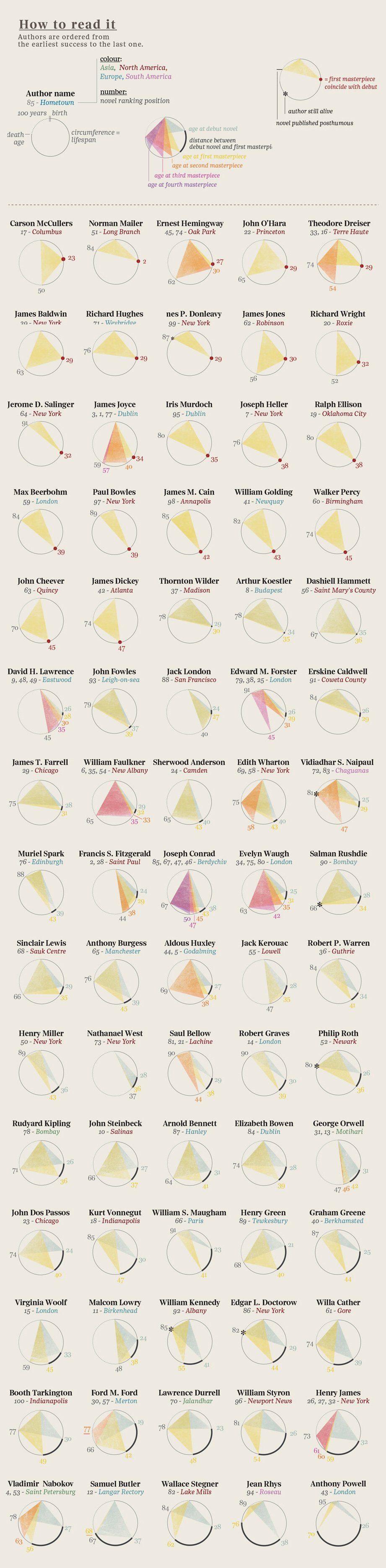

As the legend indicates, begin at an author's birth (at noon on the top of the circle) then move clockwise (around to midnight) representing an elapsed time of 100 years. Triangles are drawn connecting notable events in these literary lives (birth, publication(debut, masterpieces), and death). Authors' ages at their debut mark the vertex of one triangle (with birth and death). Ages, at the publication of of their masterpieces, are marked by the vertices of other shaded triangles. For many authors, their careers are displayed as a single triangle, showing that their masterpiece was their debut work. Others have several notable works, represented by overlapping shaded triangles. This provides a stylish depiction of these literary lives. But a long-lived author with a lone, early debut masterpiece (e.g. Norman Mailer) might have a triangle of the same size as one whose notable life was cut short (e.g. Jack London). Our eyes/minds are drawn to the sizes of the triangles. What are we to learn from the most central feature of these displays?


Monday, October 21, 2013
Best American Infographics of 2013

And another showing how the DNA analysis of canine genes cluster into four broad categories of dogs.

Subscribe to:
Posts (Atom)