Showing posts with label time series. Show all posts

Monday, September 19, 2016

Wow, It's Hot

From xkcd, a timeline of the earth's temperature from 20,000 BCE to the present, best seen here.
When people say "the climate has changed before" these are the kind of changes they're talking about.
Since the last ice age glaciation, at no time has the climate changed faster than in the last few generations!

Monday, May 2, 2016

Semester's End

It's the end of the semester and I saw this Post-It Note graphic that shows exactly how many people, especially students, approach an assignment's deadline. From Instagrammer Insta-Chaz via Visual News.

Monday, April 25, 2016

Happy Deathday Will?


In honor of William Shakepeare's 400th deathday, An infographic from Raconteur showing a timeline of the World's Greatest Storytellers (compete with local magnification) as surveyed by authors, journalists, writers, and students. The size of the bubble corresponds to the number of votes. Shakespeare looms large overall as the greatest story teller of the all. Happy Death-day Will.

(Earlier I posted Happy Birthday wishes, misled as others were on the web, but I was wrong. It is Will's Deathday and I corrected my posting, although I thought only Saints were to be remembered on their Death-day. Shakespeare was a genius, but I don't think many would call him a Saint).

Monday, January 25, 2016

The Miracle of Vaccinations

  
This interactive graphics from the Wall Street Journal multimedia editors Tynan DeBold and Dov Friedman shows the miracle of vaccinations for the US over the last 80 years. Horizontally, are years from 1928 through to 2012. Vertically, are placed the states, plus DC. A vertical line down the center shows when vaccinations for measles were introduced, in 1963. Each year-state block is heat-coded: red indicating many infections down to dark blue (and even lower light blue and white) with few to no infections. Before 1963, the many years of infections produce a very colorful pattern suitable for a nice beach shirt. After 1963, and measles vaccination, we have a basic blue dress shirt. Here boring is the goal. Basic blue is to be sought. The message is remarkable. Vaccinations are amazingly effective. You can see many more of these vaccination success plots here. These plots have won best visualizations awards for 2015.

Monday, November 9, 2015

Painting with Emotions

Graphic designer Giestas mapped his emotions to colors and published them in vertical strips over time. Volume 1 displays his hourly emotions in a single day.
 Volume 2 displays the emotions he expressed on the top half of the page and emotions he felt on the bottom half.
 Volume 3 displays three horizontal strips of emotions expected, felt at the time, and remembered 24 hours later.
The complete mapping is shown in only a few images that make it difficult to see what emotions are in the lower left hand corner. I have attempted to decipher them more fully into the following image.
 We've seen a graphic of emotions from an earlier post about the Pixar movie Inside Out.


Monday, September 15, 2014

Latitude and the Drought

Using California's range of latitude for a color coded plot of the severity of its drought over time, via xkcd.

Monday, July 21, 2014

Adding Economic Noise

Two months ago the New York Times had a very informative visualization of monthly economic data with added variability due to sampling error. In the above screen shot we can see how repeated sampling variability can change a steady job growth graph to many different shapes of what it might have looked like with repeated sampling.
Here is another, an accelerating job growth graph and one possible result of the same graph with sampling variability showing very stable job growth, via Statistical Modeling ... One commenter there notes how easy it is for us to reading meaning into random noise.


Monday, April 21, 2014

Misleading Inverted Time Series

Here is a graphic published by Reuters that has been making the rounds on the web, here and here. It depicts the number of gun deaths in Florida. On first glance it appears that gun deaths had dropped just after 2005 when Florida enacted its 'Stand Your Ground' law. The trouble is, the vertical scale is inverted: higher numbers are lower on the graph not higher. The post on the Business Insider showed the graph presented in a more standard way: higher numbers are plotted higher on the graph.
Its much clearer in this graph that gun deaths in Florida increased after 2005 and the enactment of the 'Stand Your Ground' law. So why produce a graphic that is so counter to common expectations and understanding? Politics? Point of View? Artistic Vision? or as the artist says, "Personal Preference"!

The designer is Christine Chan. She says her inspiration was based on this graph from the South China Morning Post titled "Iraq's Bloody Tool" plotting deaths as dripping blood. Artistic choice or not, this approach is misleading.


Friday, November 29, 2013

Looking at Literary Lives

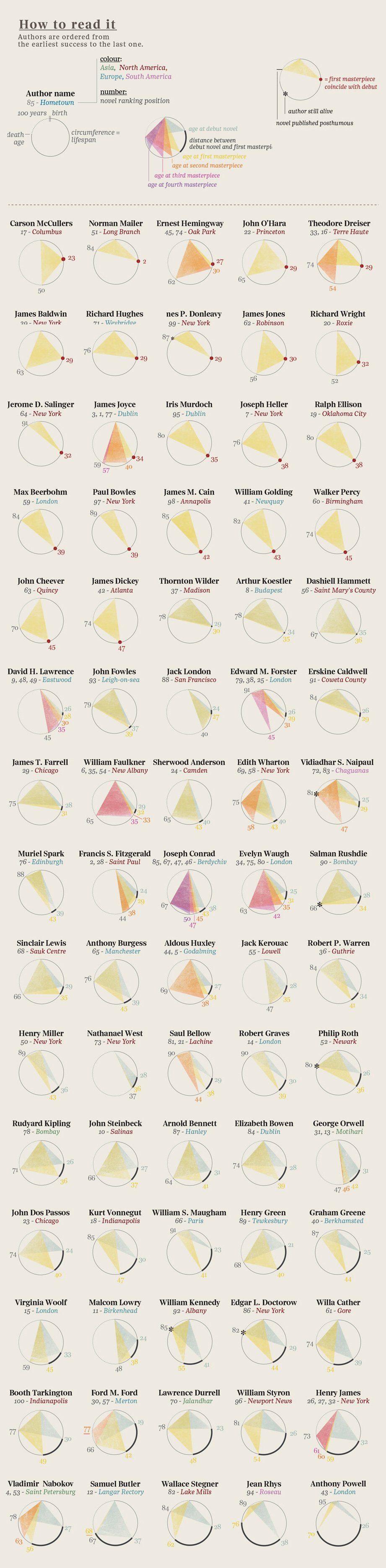
Here is a graphic showing  the event history in the literary careers of famous 20th century authors. It was produced by the design firm Accurat for one of my favorite blogs Brain Pickings. (click here for the image for all the authors). 
 As the legend indicates, begin at an author's birth (at noon on the top of the circle) then move clockwise (around to midnight) representing an elapsed time of 100 years. Triangles are drawn connecting notable events in these literary lives (birth, publication(debut, masterpieces), and death). Authors' ages at their debut mark the vertex of one triangle (with birth and death). Ages, at the publication of  of their masterpieces, are marked by the vertices of other shaded triangles. For many authors, their careers are displayed as a single triangle, showing that their masterpiece was their debut work. Others have several notable works, represented by overlapping shaded triangles. This provides a stylish depiction of these literary lives. But a long-lived author with a lone, early debut masterpiece (e.g. Norman Mailer) might have a triangle of the same size as one whose notable life was cut short (e.g. Jack London). Our eyes/minds are drawn to the sizes of the triangles. What are we to learn from the most central feature of these displays?


Monday, October 29, 2012

Pine Needle Tracks


Guest Post by Dan Drake of the University of Puget Sound:

The attached picture is of the entrance to the library at the University
of Puget Sound. It's autumn here in Tacoma and there are lots of fallen
pine needles outside which the students track in. The door opens on the
right (on the left, to entering students) and you can see the
distribution is shifted that way near the door. The pine needles are
concentrated in the middle but show a few outliers, and the light color
in the middle shows dust and dirt brought in -- so there's a discrete
and continuous distribution.

The two dimensions of the carpet show a sort of time series: near the
door, people (and hence the dirt and pine needles) are shifted towards
the side of the door that opens, and as they walk into the library, they
tend to move to the center of the entryway.

Thanks for maintaining the blog -- I (and hopefully my students...)
enjoy it!

Thank you Dan for your interest and submission.
I'll have more on pine needles next week.

Monday, August 13, 2012

Great graphics! Time series plots and scatterplot movies by Kevin Quealy, Graham Roberts, and Amanda Cox from the New York Times graphic staff on the history of Olympic swimming and track and field results. Wonderful.

Tuesday, November 3, 2009

Time Series Heat Map in R


The Revolutions blog gives information on the statistical programming language R. Heat maps are shown in a recent post. A calendar is displayed horizontally with days of the week in rows and months arranged in jagged columns (since not all months have the same number of days). A color is plotted on each month's day for the magnitude of a time series variable (in this case the stock price for Microsoft) over several years of calendars. The site gives R code developed by Paul Bleicher, MD PhD, Chief Medical Officer at Humedica for producing these plots.

Monday, September 24, 2007

Gapminder


An amazing interactive Flash implementation shown here of scatterplot graphics related to world development. Multiple dimensions, variable transformations, geographic anchors, time series visualization, etc. An outstanding interactive graphic!