Monday, December 30, 2013

Happy New Year

Is it better to be right or be happy? A British Medical Journal report investigates this research question in their lighthearted Christmas issue. The research sample consisted of one married couple (n=2). The female was blind to the null hypothesis being tested: it is better to be right than happy. The female was assigned the "right" condition. The male was assigned the condition of agreeing with the female's "every opinion and request without complaint." Happiness was measured on a 10 point Likert scale labeled Quality of Life. Unfortunately this study was terminated early because of "severe adverse outcomes." The males Quality of Life fell 4 points in 12 days, whereas the female's Quality of Life increased slightly from 8 to 8.5. The researcher's findings: "The results of this trial show that the availability of unbridled power adversely affects the quality of life of those on the receiving end."

Be nice in the new year and be happy.

Monday, December 23, 2013

Probability of a White Christmas


The map above is the current snow cover (as of 13 December 2013) in the US according to the weather.com. Compare this to National Oceanic and Atmospheric Administration map from the last few years of Christmas morning snow cover over the last five years.
Combining such maps from 1908 to 2010, NOAA maps out the probability of a white Christmas (that is, 1" of snow on the ground).


They also have a report from 1995 that maps the probability of 1", 5", or 10" of snow on Christmas morning.

Except for the Northeast, a many of the areas of the greatest chances are not densely populated. 
I wonder, what is the expected percentage of the US population that experiences a white Christmas?

Happy Holidays.


Monday, December 16, 2013

Scatterplot Waldo

Slate.com staff writer Ben Blatt has examined the wide range of Where's Waldo picture books,
looking for a useful search strategy to find Martin Handford's elusive cartoon character. Blatt plotted the horizontal and vertical page location of Waldo in 68 pictures in, what he calls, the seven "primary" Where's Waldo books. He claims to have sat for three hours with a tape measure in a Barnes & Noble bookstore and measured Waldo's location on each 20" X 12.5" two-page spread. The image above shows these locations and two horizontal bands of 1.5" each: one three inches from the bottom of the page and the other seven inches from the bottom. Blatt found that Waldo can be found in these bands in 53% (36) of the 68 images.

We can see the higher frequency of occurrence in bands by finding the marginal histograms from digitized locations in Blatt's scatterplot (data shown below). Here is the marginal histogram of the vertical locations of Waldo. The regions found by Blatt stand our prominently in the two modal peaks in the histogram.
Horizontally there is a less prominent patten of the locations across the two-page spread.
Perhaps we could improve on the two-vertical-strips strategy by concentrating on the far left and far right of the two-page spread with then a glance just left of center?
Here are the data:
horizontal vertical horizontal vertical horizontal vertical horizontal vertical
1.02 11.97 9.52 7.21 11.79 6.22 8.8 2.95
7.78 10.22 10.51 7.71 14.78 5.72 12.57 3.71
8.51 9.99 11.52 7.97 14.51 4.96 17.76 3.97
9.26 9.46 11.29 6.95 18.03 5.43 18.03 4.21
10.77 10.48 12.19 7.77 18.75 5.43 19.01 4.47
11.99 11.48 12.51 8.24 1.8 3.97 16.81 2.95
13.27 10.48 12.51 7.48 1.31 3.45 1.04 2.72
16.26 11.21 14.51 8.21 2.26 3.18 1.54 1.93
19.48 12 14.25 7.21 3.77 4.21 1.54 1.43
16.26 9.99 15.62 7.48 3.51 3.45 3.28 1.2
17.5 9.99 17.24 7.48 3.8 3.45 7.29 1.93
17.74 9.46 18.49 7.21 5.31 3.97 8.27 1.2
15.5 8.97 19.25 7.48 4.79 2.98 8.53 0.44
5.78 8.24 2.76 6.75 5.54 3.21 10.54 2.45
6.76 7.97 3.8 6.98 6.76 4.44 17.5 2.69
7.52 8.47 3.28 5.96 8.27 4.21 19.48 2.45
8.51 8.47 5.54 6.72 9.03 3.45 18.98 1.93


Monday, December 9, 2013

Scatterplot Artists

Here is a scatterplot of writers placed, very subjectively, by J. Chen at htmlgiant on scales of Mediocrity to Genius on the horizontal axis and Modesty to Arrogance on the vertical.  Some eclectic combinations along straight lines: Tom Wolfe, John Updike, T.S. Eliot, Jonathan Swift(?), and D.F. Wallace along a line of decreasing arrogance and increasing genius. He's also produced similar scatterplots for musicians: rappers and rockers (+Miles Davis?). For the writers, those that are Mediocre and Modest appear under-represented in his evaluation. Perhaps not surprising for writers, but check out his third quadrant for rappers.
This type of scatterplot is regularly published in the New York Magazine. Last year, the actress Meryl Streep was treated to a scatterplot that place her various movie roles on the axes from Cold to Warm and Frivolous to Serious.

And here's another from New York Magazine for Bruce Willis.
And in 2001 Newsweek magazine did the same for TV shows. For several years I referred to this in my lecture on scatterplots for Basic Statistics students. Of course, it's quite dated now. My current students were six years old when these shows were on TV!


Friday, November 29, 2013

Looking at Literary Lives

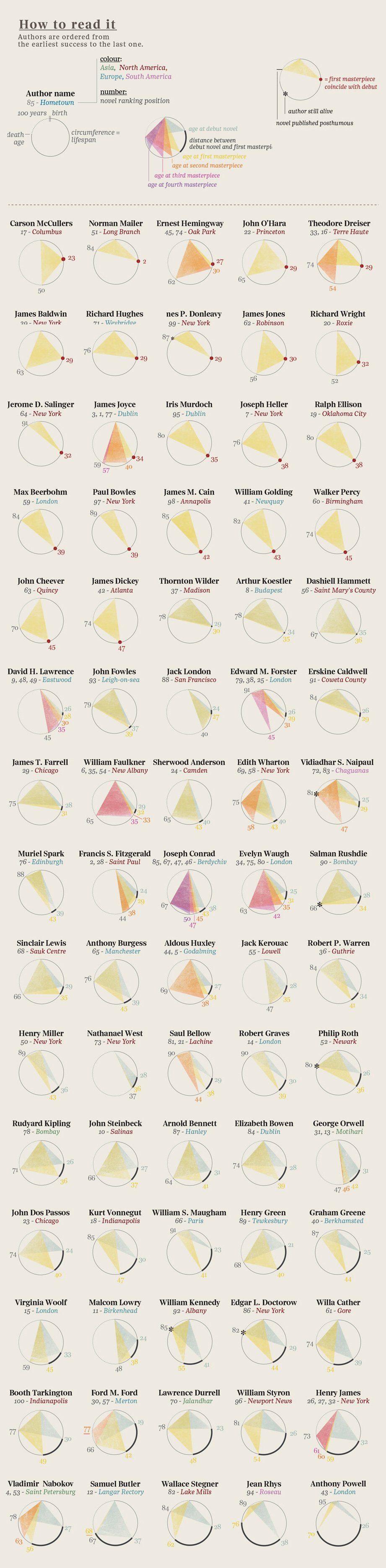
Here is a graphic showing  the event history in the literary careers of famous 20th century authors. It was produced by the design firm Accurat for one of my favorite blogs Brain Pickings. (click here for the image for all the authors). 
 As the legend indicates, begin at an author's birth (at noon on the top of the circle) then move clockwise (around to midnight) representing an elapsed time of 100 years. Triangles are drawn connecting notable events in these literary lives (birth, publication(debut, masterpieces), and death). Authors' ages at their debut mark the vertex of one triangle (with birth and death). Ages, at the publication of  of their masterpieces, are marked by the vertices of other shaded triangles. For many authors, their careers are displayed as a single triangle, showing that their masterpiece was their debut work. Others have several notable works, represented by overlapping shaded triangles. This provides a stylish depiction of these literary lives. But a long-lived author with a lone, early debut masterpiece (e.g. Norman Mailer) might have a triangle of the same size as one whose notable life was cut short (e.g. Jack London). Our eyes/minds are drawn to the sizes of the triangles. What are we to learn from the most central feature of these displays?


Monday, November 25, 2013

Transitions

Thanksgiving is this week, now through Christmas is the most heavily traveled period of the year. It brings to mind how mobile the US population is. Not just for holiday travel, but even for places to call  home. Americans are restless and we move.

Here is a clever interactive graphic illustrating this from data journalist Chris Walker and his site Vizynary (also posted by Wired.) The flows of migration from one US state to another are shown as arcs drawn between two states if at least 10,000 people moved between them in 2012. The width of the arcs indicate the frequency of migration along that path. The data came from the U.S Census American Community Survey. Interactively you can select a state and see the arcs of migration flow to other states. It reminds me of blasts of fireworks. Very well done.

Monday, November 18, 2013

Normal Snare Distribution

Here is the head of a snare drum (thanks Sean) showing the two dimensional, joint distribution of his drumstick hits. The maker, Evans, produces drum heads with two plys of plastic bonded together. In this image the pattern of wear and use reveal themselves through contour lines as closed curves indicating regions of similar frequency of use. The greatest wear is in the lightest colored central region, having seen the greatest frequency of hits. This central region has worn through the first ply showing the remaining plastic support underneath. Sean seems to have a very stable left hand, consistently hitting this small central region in nearly a circular pattern. In this region, the horizontal location of his hits seems independent of the vertical, producing this near circular pattern of the joint distribution. Surrounding this is the darker region of the top ply of plastic. This layer retains more dirt and grime than the underlying supporting plastic. Again the pattern of these hits is nearly circular. It turns out that with simple assumptions, like radial symmetry and independence, the pattern can be shown to be that of a bivariate normal distribution. A result that was thought first published (p. 398) by John Herschel in 1850, but actually discovered much earlier by the American mathematician Robert Adrain in 1808. More details on that in a future post.

But here, perhaps we see slight deviations from normality. The darker ring seems to show slightly  more variability extending vertically and a greater clustering of hits on the bottom of this image. This indicates a bit of skewness towards the top of the picture. Less use and wear is finally shown in the cream colored outer region that has seem very few hits. Thanks again Sean.